BRILLIANT CURRENCY KEY
Product visual design & lllustration
BRILLIANT CURRENCY KEY CASE STUDY • 2026Designing a currency key and companion icon system to represent free lessons, premium access, and gamification across Brilliant’s learning platform.

ROLESenior Illustrator
TIMELINEMay-June 2025
Creative Director, Marketing Director, Head of Product, Product Design, Content, Head of Content, Project Management
TEAMIconography, Product Art, Visual Systems Design, Visual Metaphors, Gamification Design
SKILLSDesigning a visual language for learning and access
01. OVERVIEWBrilliant was updating its product art to support a brand refresh and gamification initiative. The project centered on a Currency Key with two connected roles: representing the number of free lessons available and communicating access to premium content. I designed the key and companion icons to establish a cohesive visual metaphor system across product, marketing, and content.
FINAL PAYWALL ARTFINAL LOGGED-IN HOMEPAGE PRODUCT ART AND CURRENCY KEY, SHOWING PREMIUM ACCESS AND FREE LESSON METERINGExploring a metaphor for Brilliant’s new direction
02. VISUAL RESEARCH & DISCOVERYThe brief connected Brilliant’s ‘League of Problem Solvers’ concept with a portal visual anchor. I explored how currency, streak charges, and practice could relate to that world, including futuristic keys, fuel cells, and other familiar objects. The early work exposed a challenge: forcing every metaphor to connect to the portal made the system harder to resolve.
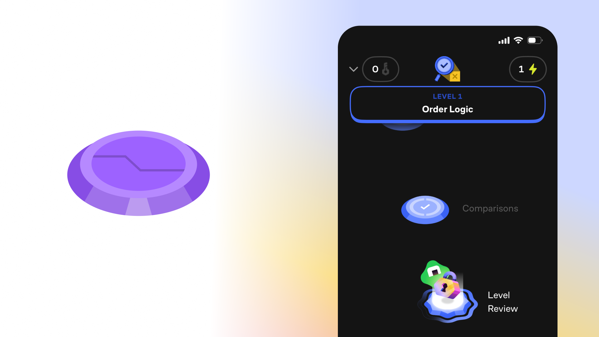
PORTAL ANCHOR AND LEARNING PATH WITH THE PORTALSEARLY FUTURISTIC KEY CURRENCY CONCEPTSEARLY CURRENCY CONCEPTSFinding the key’s form at icon scale
03. DESIGN PROCESSThe first turning point was moving toward familiar real-world objects. A futuristic key gave the currency a recognizable starting point, while shared visual styling could connect it to the wider icon suite.
As I developed the direction, the more complex designs proved difficult to scale down. I changed the process and began designing at icon level, then expanded the chosen form into larger spot illustrations. I also tested the assets in product design mockups to evaluate them in context.
COMPLEX EXPLORATIONS THAT WERE HARD TO SEE AT SMALL SCALESIMPLIFYING THE DESIGN BY STARTING AT ICON SCALEA shared style for familiar objects
The system uses recognizable objects to represent different product concepts. The key, padlock, bolt, battery, and dumbbell share a dimensional treatment, while each keeps a distinct silhouette. This gave the suite a common visual language without requiring every object to reference the portal.
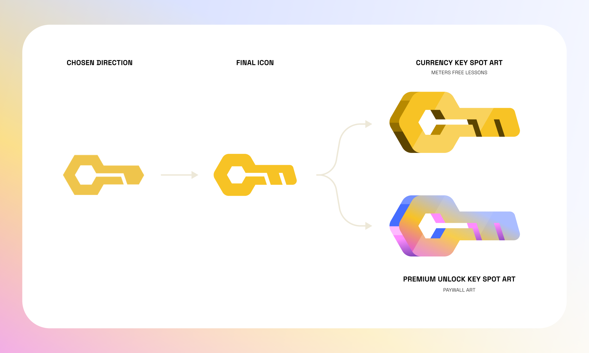
GOING FROM ICON DESIGNS TO COMPLEX ARTCURRENCY DESIGN IN CONTEXT WITH OTHER VISUAL METAPHORSOne key across icons and product illustrations
04. FINAL SYSTEMSThe final direction carries the key from a simplified UI icon into dimensional spot art. A gold treatment represents free lessons, while an iridescent treatment appears in the premium unlock artwork. The key and keyhole connect lesson metering and premium access through a shared visual metaphor, with different treatments for each context.
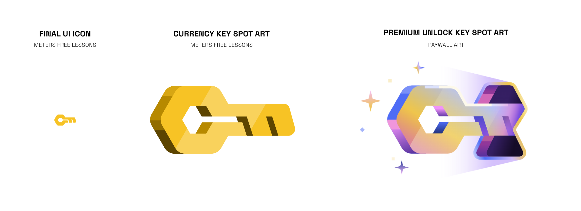
FINAL UI ICON, GOLD CURRENCY KEY SPOT ART, AND IRIDESCENT PREMIUM UNLOCK ARTFrom the Currency Key to a broader icon family
05. EXPANDING THE SYSTEMThe Currency Key was the central design in a larger suite I created for Brilliant’s gamification and content access systems. I extended the visual approach to a padlock for locked content, a bolt for streaks, a battery for streak charges, and a dumbbell for practice, carrying the family across product UI and marketing contexts.
THE KEY AND PREMIUM ART ACROSS PRODUCT CONTEXTSKEY—FREE LESSONS; PADLOCK—LOCKED CONTENT; BOLT—STREAK; BATTERY—STREAK CHARGE; DUMBBELL—PRACTICEEstablishing a consistent language for premium
06. IMPACTThe project delivered a Currency Key and companion icon suite spanning lesson metering, premium access, and gamification. The iridescent gradient treatment I developed became a standard visual treatment for premium content across Brilliant’s product and marketing. Together, these assets established a consistent visual language for communicating access and progression across those contexts.
IRIDESCENT PREMIUM ART AND ITS APPLICATION ACROSS PRODUCT CONTEXTS07. RETROSPECTIVEKey takeaways
01. Let familiar objects carry the meaning
Trying to connect every icon to the portal made the metaphors harder to resolve. Moving toward familiar objects gave each concept a clearer starting point, while visual styling connected the suite. The lesson I took forward was to let an object’s meaning guide the metaphor and use style to build consistency.
02. Start at the smallest size
Some of the early key designs became too complex at icon scale. Starting with the small UI version gave me a stronger foundation before developing larger spot art. It reinforced the value of designing around the most constrained use case and checking the work in product mockups as it develops.