YAHOO IQ TRIVIA!
Casual gaming brand design & product strategy
YAHOO GAMES IQ TRIVIA CASE STUDY • 2026
Redesigning Yahoo Games' IQ Trivia entry experience with a playful visual identity, scalable game-card system, and recognizable owl mascot.
ROLEBrand & Visual Designer
TIMELINE2-Week Sprint
Head of Games
Product Manager
Brand Studio
Design Studio
TEAMBrand Identity, Visual Systems, Illustration
SKILLS01. OVERVIEWDesigning a playful brand identity for Yahoo's modern trivia audience
Yahoo Games wanted to refresh how IQ Trivia appeared across its homepage and game-card surfaces. The existing design lacked a distinctive visual identity and crucial game context. The brief called for a more playful, recognizable entry experience anchored by a character mascot and a flexible illustration system for trivia topics.
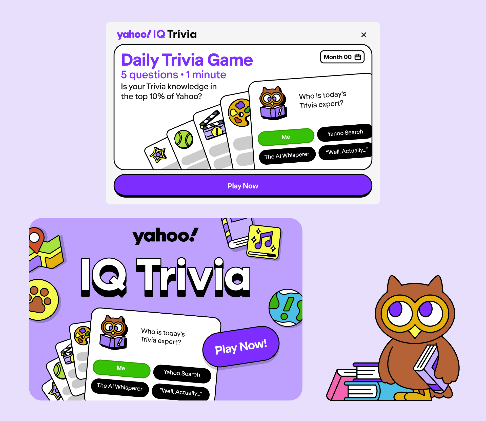
POLISHED IQ TRIVIA HOMEPAGE ENTRY MODULE (TOP) AND GAME CARD DESIGN (BOTTOM) FEATURING THE BRAND OWL MASCOT AND COLORFUL GAMING COMPONENTS02. VISUAL RESEARCH & DISCOVERYExploring the casual trivia landscape
I reviewed casual trivia and puzzle experiences across mobile and web to understand how games communicate personality, difficulty, and play at a glance. The exploration helped establish a direction centered on bold visual anchors, clear hierarchy, and an approachable game-first experience.
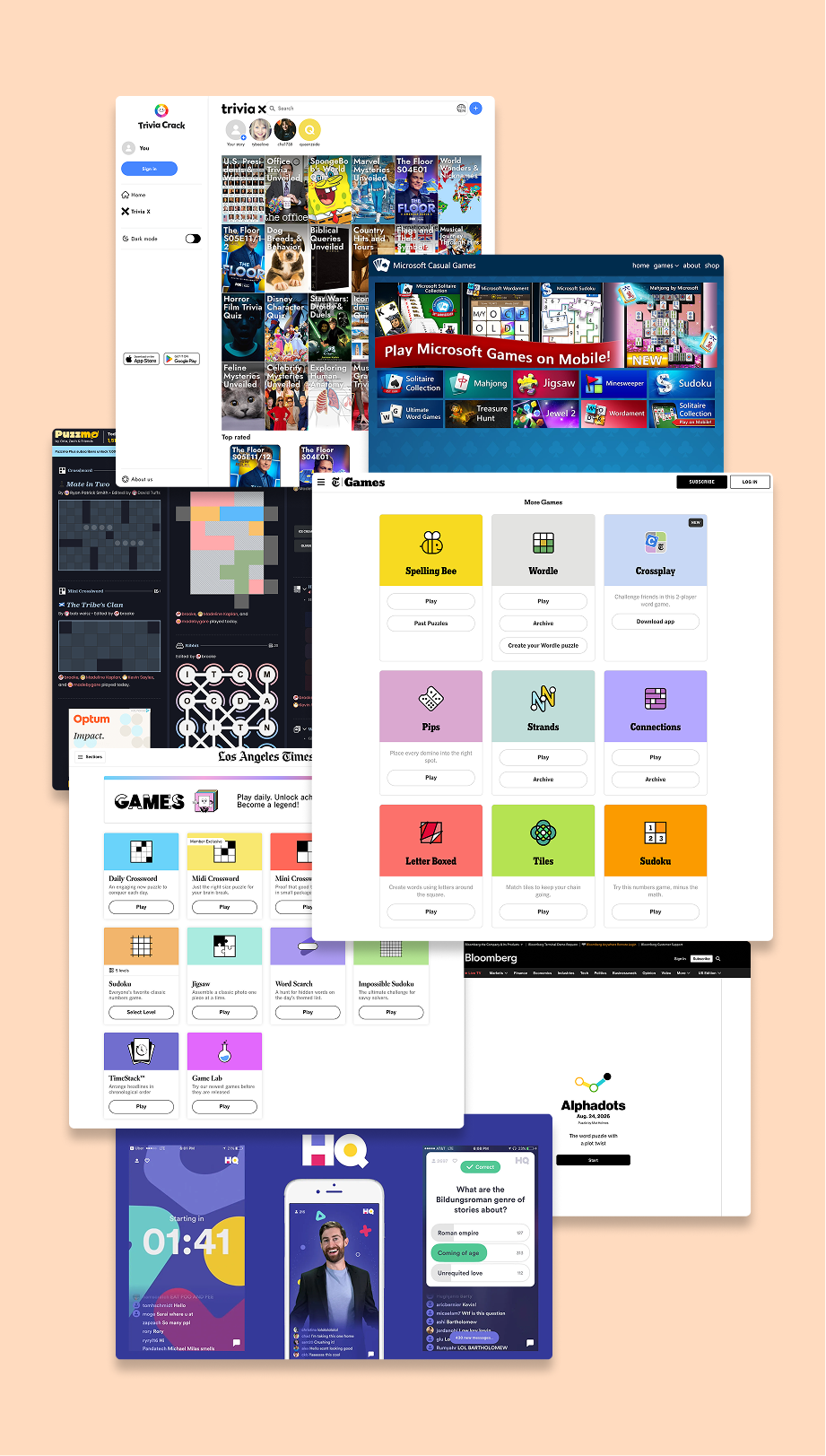
COMPETITIVE VISUAL ANALYSIS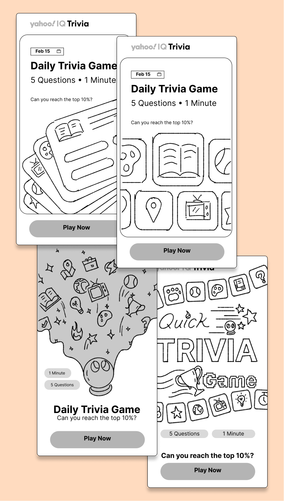
EARLY VISUAL EXPLORATION AND SKETCHING03. DESIGN PROCESSBuilding a visual language around curiosity and play
The mascot needed to make IQ Trivia feel intelligent without becoming overly academic or serious. After exploring several character directions, the owl emerged as the strongest balance of curiosity, knowledge, and personality.
I refined its proportions, expressions, line weight, and poses while developing a companion system of 10+ topic illustrations spanning science, geography, history, pop culture, and more. Shared outlines, simplified forms, and bold spot colors helped the assets feel cohesive at small UI sizes.
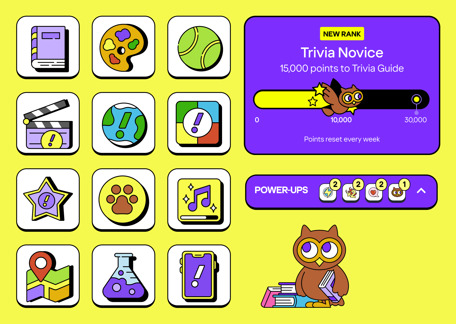
FINAL CATEGORY TOPIC ICONS AND OWL ASSETSA flexible illustration system
The system pairs Yahoo's expressive color palette with consistent outlines, simplified geometry, and high-contrast compositions. These constraints created enough consistency to feel like one family while leaving room for each trivia subject to have its own personality.
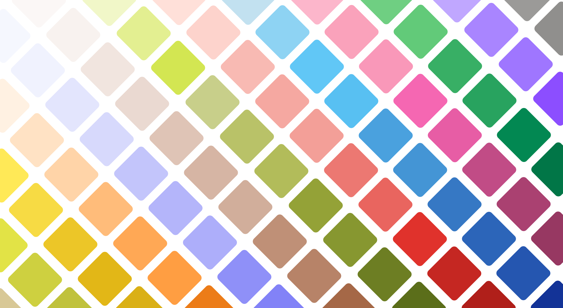
WORKING WITH YAHOO’S COLOR SYSTEM04. FINAL SYSTEMSA scalable visual system for Yahoo Games
The final direction combined bold typography, expressive illustration, and a prominent play action within a repeatable card structure. I designed the system to adapt across three core formats, allowing the identity to remain recognizable as layouts became progressively smaller.
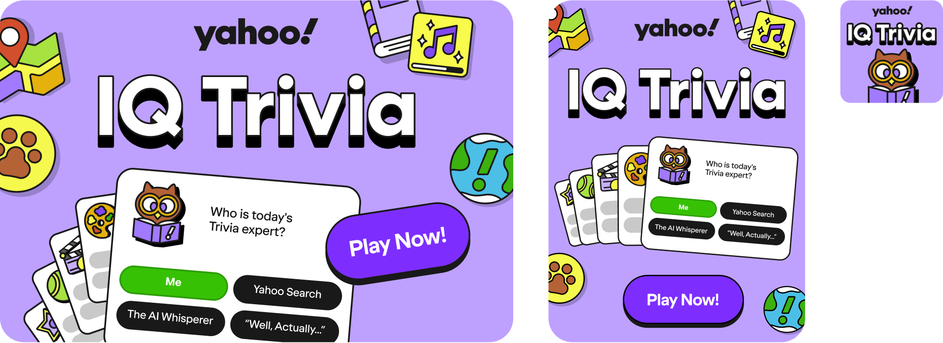
GAME CARD DESIGNS IN 3 SIZES: 600x400, 300x400, AND 120x12005. EXPANDING THE SYSTEMFrom one game to a broader system
The visual framework established for IQ Trivia became a useful foundation for additional Yahoo Games work. I later applied and evolved the approach across Mini Crossword, Pile-Up Poker, Circuits, Ribbit, and SpellTower, adapting each game's personality while maintaining a recognizable family resemblance across the platform. Play the games at Yahoo Games.
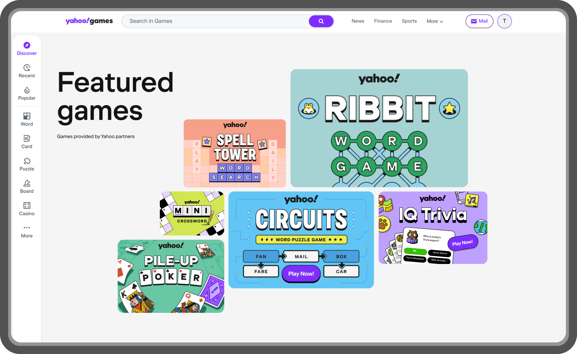
ALL FIVE OF THE GAME CARDS ON YAHOO'S FEATURED GAMES PAGE. VIEW ON YAHOO!FULL LINEUP OF ALL SIX TITLES IN THREE DIFFERENT SIZES: 600×400, 300×400, and 120×12006. IMPACTSupporting a growing games platform
Yahoo Games continued to see significant audience and engagement growth in 2026 as the company expanded its investment in first-party casual games. My work on IQ Trivia and the broader game-card system contributed to this larger initiative by helping create a more cohesive and recognizable visual presence across the portfolio.
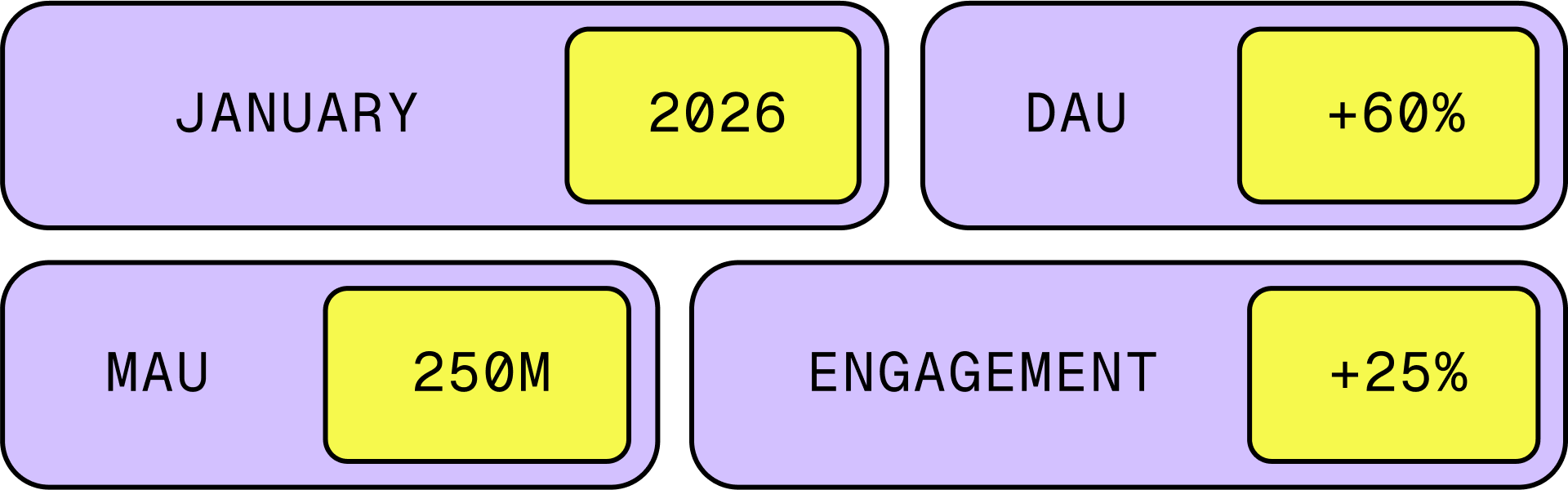
FROM A GAMESBEAT ARTICLE WITH YAHOO’S HEAD OF GAMES, ANDREW PEDERSEN07. RETROSPECTIVEKey takeaways
01. Show the game, don't just describe it
Bringing recognizable gameplay elements into the game cards helped communicate each game's mechanics and personality at a glance. Rather than relying on marketing copy alone, the visuals gave players a better sense of what to expect before they started playing.
02. Sketch first, refine later
Starting with black-and-white sketches kept the early design process focused on concepts and composition rather than color. This made it easier to explore ideas, gather meaningful feedback, and align with stakeholders before moving into more polished designs.