YAHOO MINI CROSSWORD
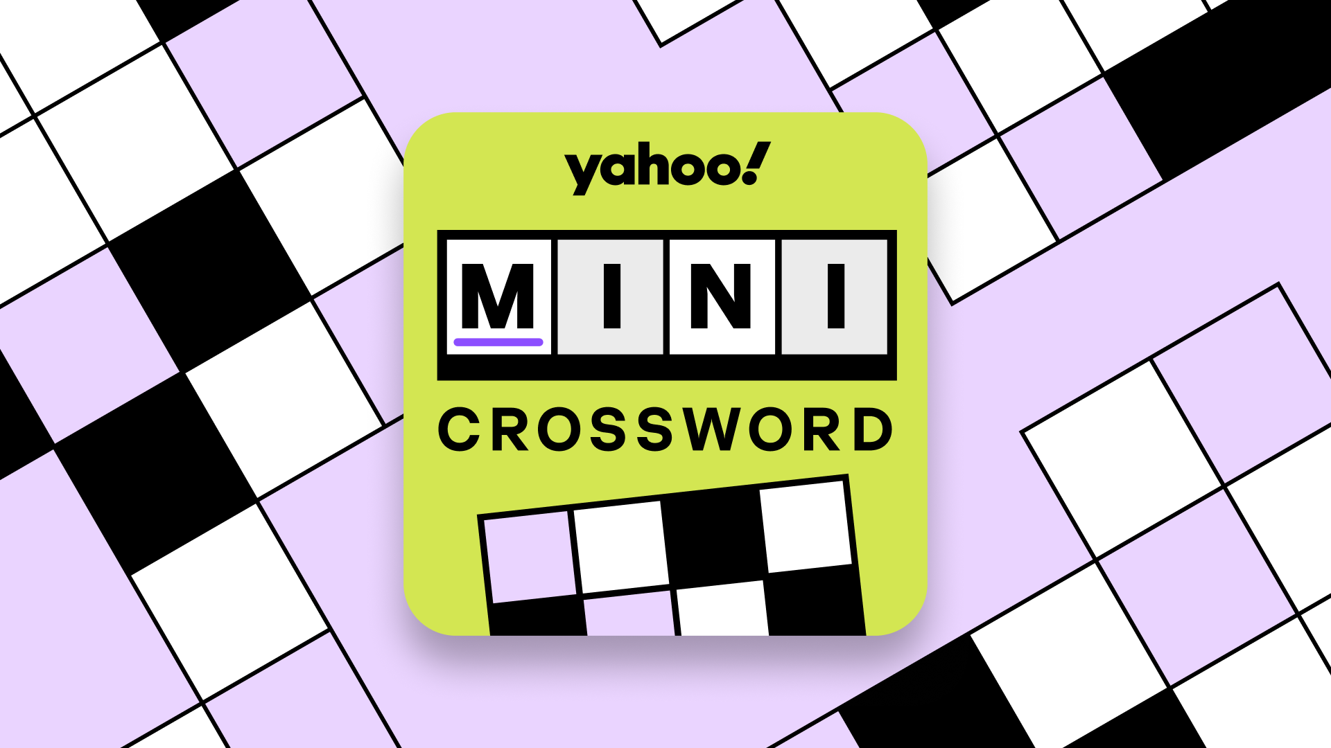
A playful crossword identity built for the Yahoo Games family
YAHOO CASE STUDY • 2026Designing a distinctive visual identity for Yahoo Mini Crossword through bold typography, recognizable gameplay elements, and a scalable game-card system.
ROLEBrand & Visual Designer
TIMELINE2-Week Sprint 2026
Head of Games, Product Manager, Brand Studio, Design Studio
TEAMBrand Identity, Visual Systems, Illustration
SKILLSGiving Yahoo Mini Crossword its own identity within a growing games portfolio
01. OVERVIEWYahoo Games was launching Mini Crossword, a new daily word game that needed a recognizable identity within its expanding casual games portfolio. Building on the visual language established for IQ Trivia, I designed a logo, game-card system, and promotional assets that balanced Yahoo's playful personality, established style, and competitive differentiation. The challenge was to communicate the familiar crossword experience while emphasizing its smaller, more approachable format.
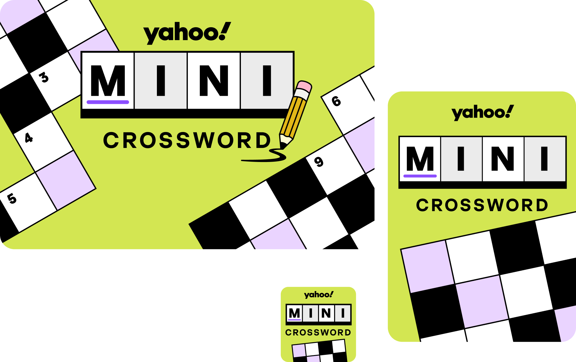
YAHOO MINI CROSSWORD BRAND IDENTITY, GAME CARDS, AND PROMOTIONAL ARTWORKFinding the balance between familiar and distinctive
02. VISUAL RESEARCH & DISCOVERYI reviewed existing Yahoo Games designs and competing crossword games to understand how they communicate gameplay, personality, and difficulty.
With Yahoo's visual language already established, the challenge wasn't to reinvent the system. It was to identify what made Mini Crossword unique and translate that into a recognizable identity.
The exploration focused on three elements: crossword grids, typography, and visual cues that communicate a quick, approachable puzzle experience.
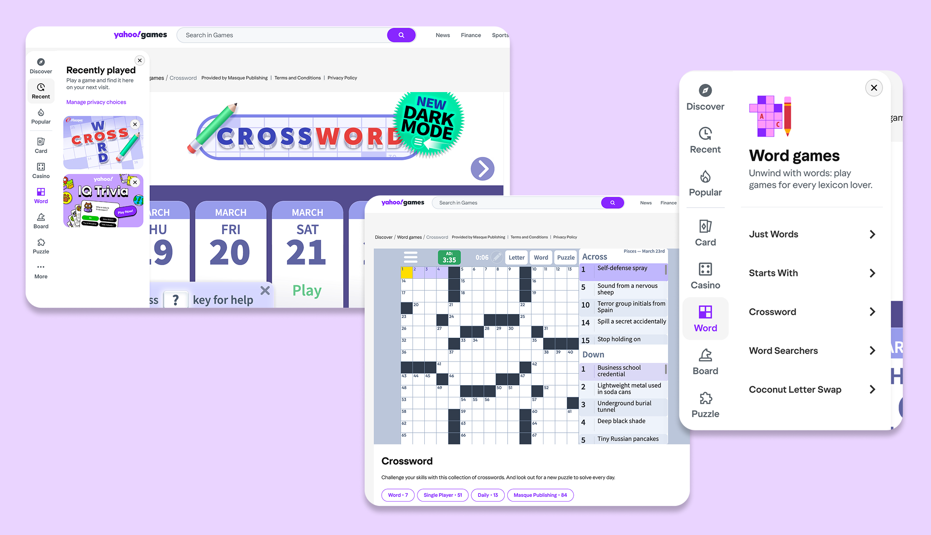
VISUAL AUDIT OF THE EXISTING WORD GAMES ON YAHOO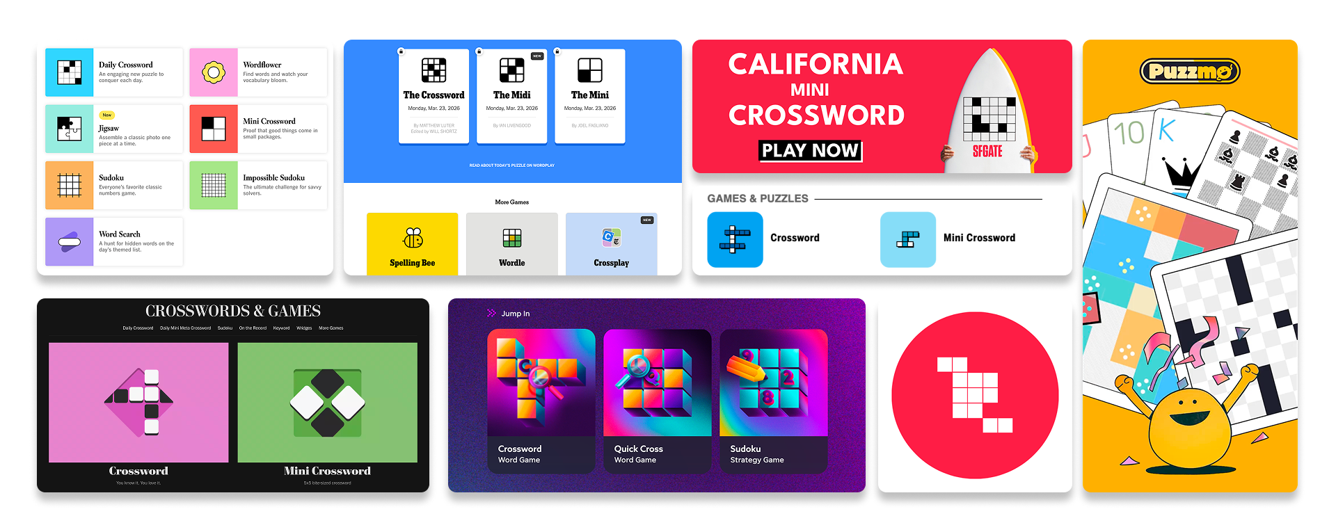
VISUAL RESEARCH INTO CROSSWORD GAMES AND COMPETITIONSMaking the crossword grid the centerpiece
03. DESIGN PROCESSRather than relying on decorative illustrations alone, I explored ways to bring recognizable crossword elements directly into the identity.
The strongest direction placed the game's title inside a crossword grid, allowing the typography to communicate the gameplay itself. A pencil illustration added a playful touch while reinforcing the familiar experience of solving a crossword.
I refined the composition, lettering, and supporting elements to create a design that felt both distinctly Yahoo and immediately recognizable as a crossword game.
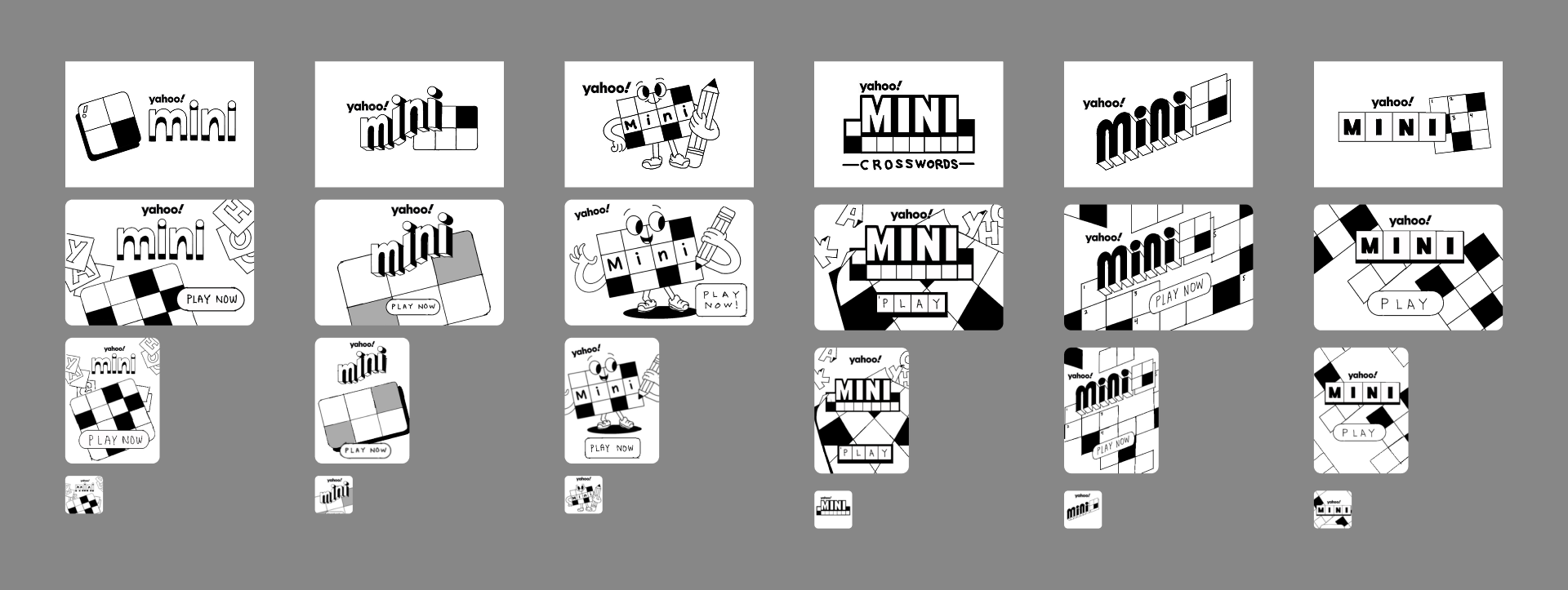
LOGO EXPLORATIONS REFINING TYPOGRAPHY, CROSSWORD GRID COMPOSITIONS, AND COLORBuilding personality within an established system
With the core identity established, I explored how the crossword grid, pencil, and supporting graphics could work together across different compositions. The grid became the primary visual anchor, while bold colors and playful illustrations connected Mini Crossword to the broader Yahoo Games family.
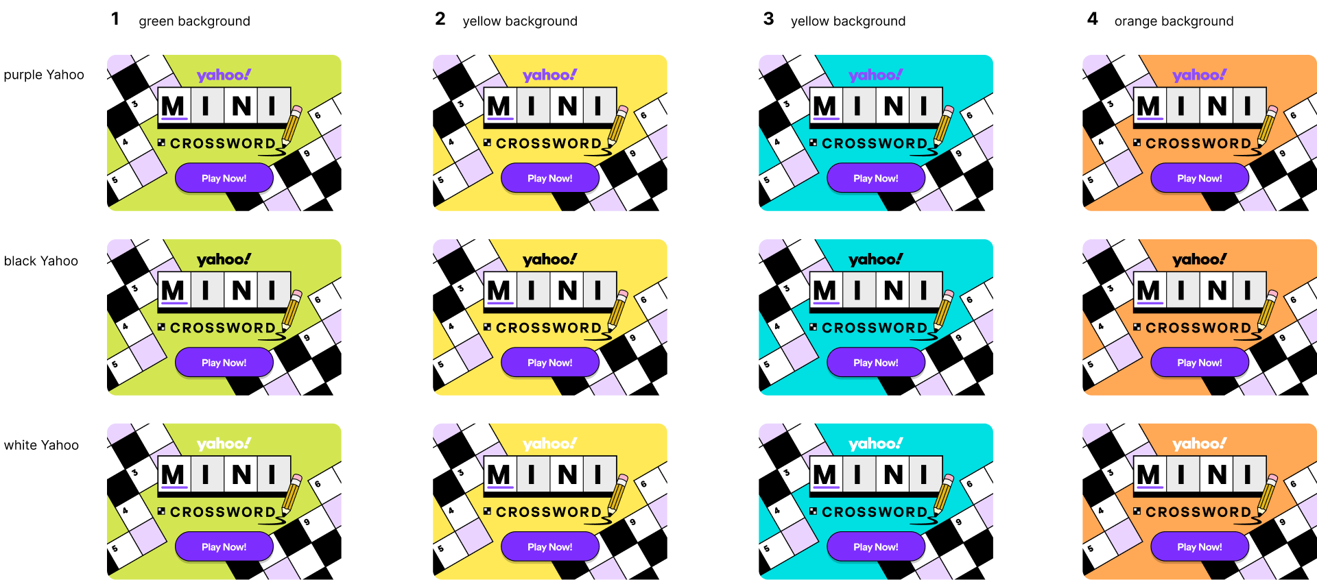
GAME CARD EXPLORATIONS USING THE CROSSWORD GRID AND YAHOO'S EXPRESSIVE COLOR PALETTEA scalable identity designed for every game-card size.
04. FINAL SYSTEMSThe final design combines bold typography, crossword tiles, and a playful pencil illustration into a recognizable game-card identity. I adapted the design across multiple formats, simplifying the composition as the available space decreased. This helped preserve the game's identity and legibility across Yahoo Games' different surfaces.
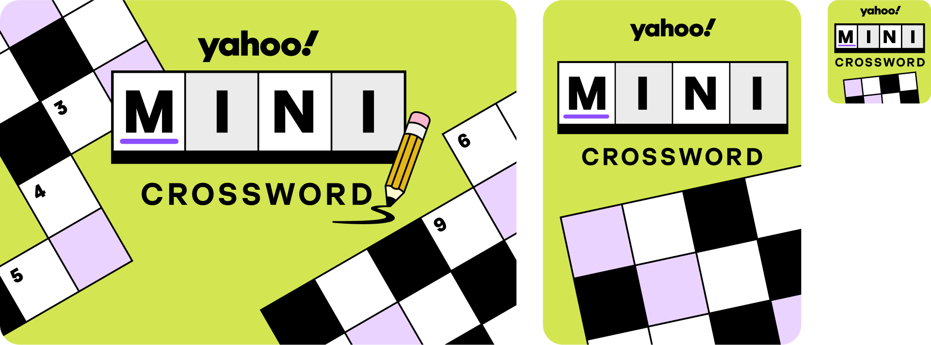
FINAL MINI CROSSWORD GAME CARDS IN THREE SIZES: 600×400, 300×400, AND 120×120From game cards to a broader brand experience.
05. EXPANDING THE SYSTEMThe Mini Crossword identity extended beyond its primary game card into promotional artwork and supporting placements across Yahoo Games. By reusing the crossword grid, typography, and pencil motif, I created a flexible visual language that could adapt to different formats while maintaining a consistent identity. The result was a cohesive set of assets that felt unique to Mini Crossword while remaining connected to the larger Yahoo Games portfolio.
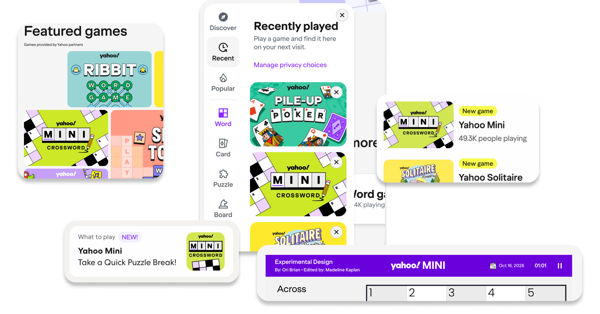
MINI CROSSWORD PROMOTIONAL ARTWORK AND COLOR EXPLORATIONS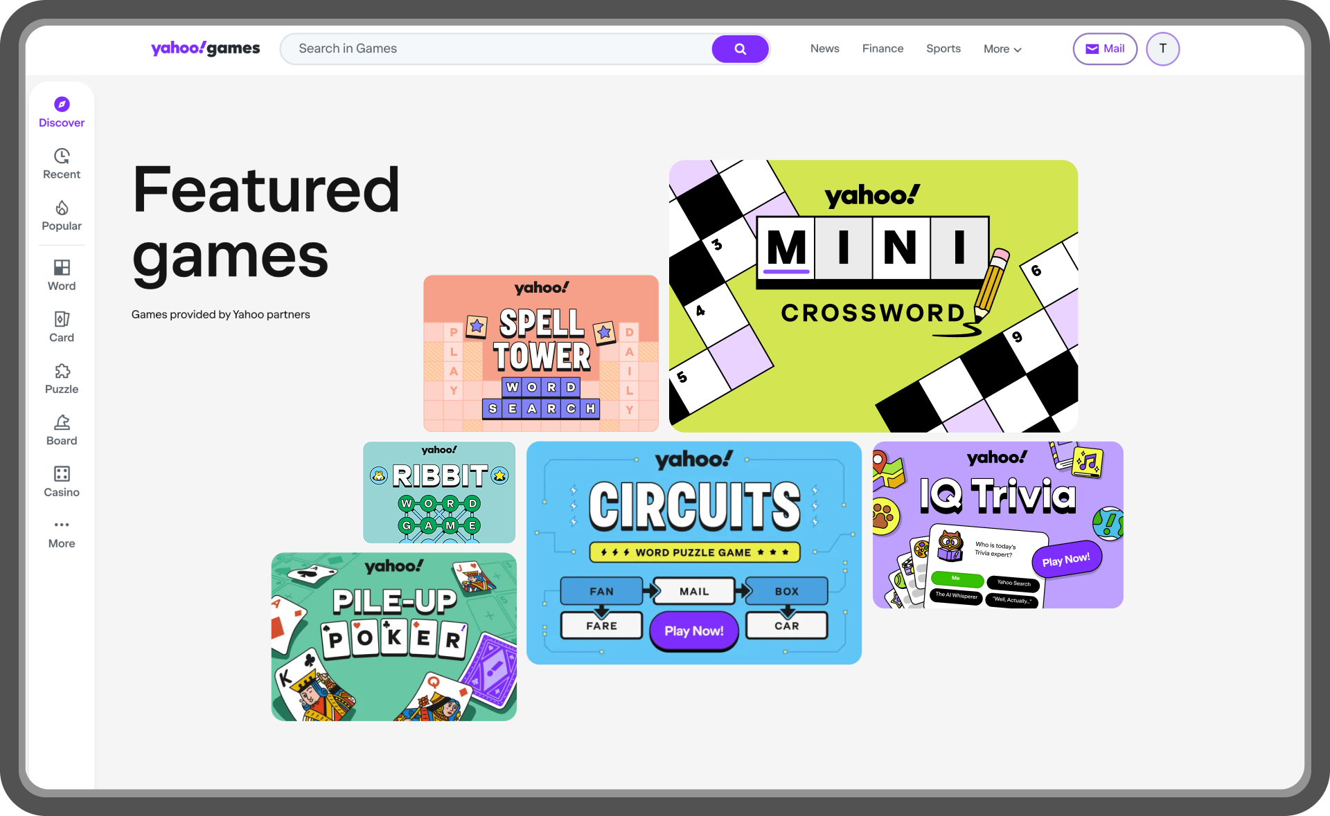
MINI CROSSWORD ALONGSIDE OTHER TITLES ON THE YAHOO GAMES PLATFORMStrengthening the Yahoo Games visual ecosystem
06. IMPACTMini Crossword extended the visual framework established for IQ Trivia into a new word-game experience. The project delivered a distinct identity and adaptable game-card system that brought greater visual consistency to Yahoo's growing portfolio of casual games. By using recognizable gameplay elements and a shared design language, the work supported a more cohesive presentation across Yahoo Games.
YAHOO GAMES BRAND IDENTITIES DESIGNED TO FEEL DISTINCT WHILE SHARING A COHESIVE VISUAL LANGUAGE07. RETROSPECTIVEKey takeaways
01. Build on the system, not from scratch
Working within an established visual language allowed me to focus on what made Mini Crossword unique. By building on Yahoo's existing design principles, I could create a distinct identity without losing consistency across the games portfolio.
02. Let the gameplay shape the identity
Using the crossword grid as a central design element helped communicate the game at a glance. Rather than relying on decorative graphics alone, I found that incorporating familiar gameplay elements created a clearer and more recognizable visual identity.